We are proud to introduce our sixth edition of Trend Beyond Colours. In the years since its inception, this forecast has evolved from a simple colour guide into an essential tool for the design community. With each edition, we have looked beyond the surface to analyse the deeper cultural currents and human behaviours that shape our world.
For 2026–27, our journey has led us to a single, powerful theme: Resonate.
As our world undergoes constant change, “Resonate” provides architects, designers, and industry professionals with the opportunity to capture the human responses to these global shifts. Moving beyond simple prescription, this edition explores how we can build essential bridges between our past and future, the physical and digital, and the self and the collective. It does this through four distinct Colour Stories, which act as a lens to understand emerging social mindsets and translate them into purposeful, tangible designs for the built environment.
Forever Well: Designing for Longevity and Balance
As we embrace longer lives, wellness is no longer a luxury but a fundamental necessity. This trend reflects a growing focus on sustainability, holistic practices, and spaces that actively restore and care for us.
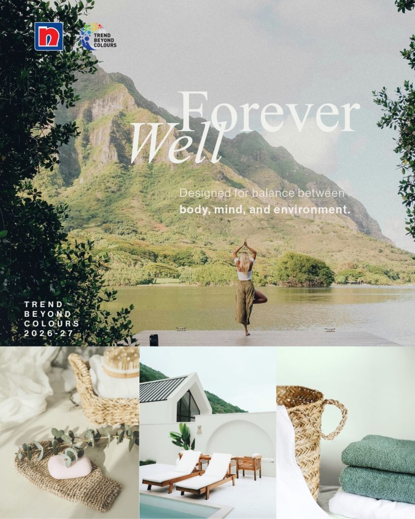
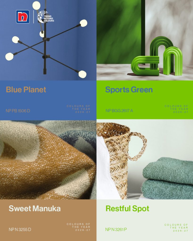
For architects and designers, this translates into an increased demand for environments that evoke a sense of calm, cleanliness, and restfulness. Soft, clean pastels define the Forever Well palette. Hues like the gentle Restful Spot, Rose Thoughts, and Lychee Float create a sense of renewal. When paired with materials like reeded glass or pale green marble, these colours are ideal for healthcare, hospitality, or residential projects designed to evoke tranquillity and thoughtful reflection.
True Self: The Return to Authentic, Tactile Spaces
As a counterbalance to our fast-moving, digital world, there is a movement towards grounding, authenticity, and meaning. People are reassessing their priorities, favouring enduring quality and heritage over the transient and material.
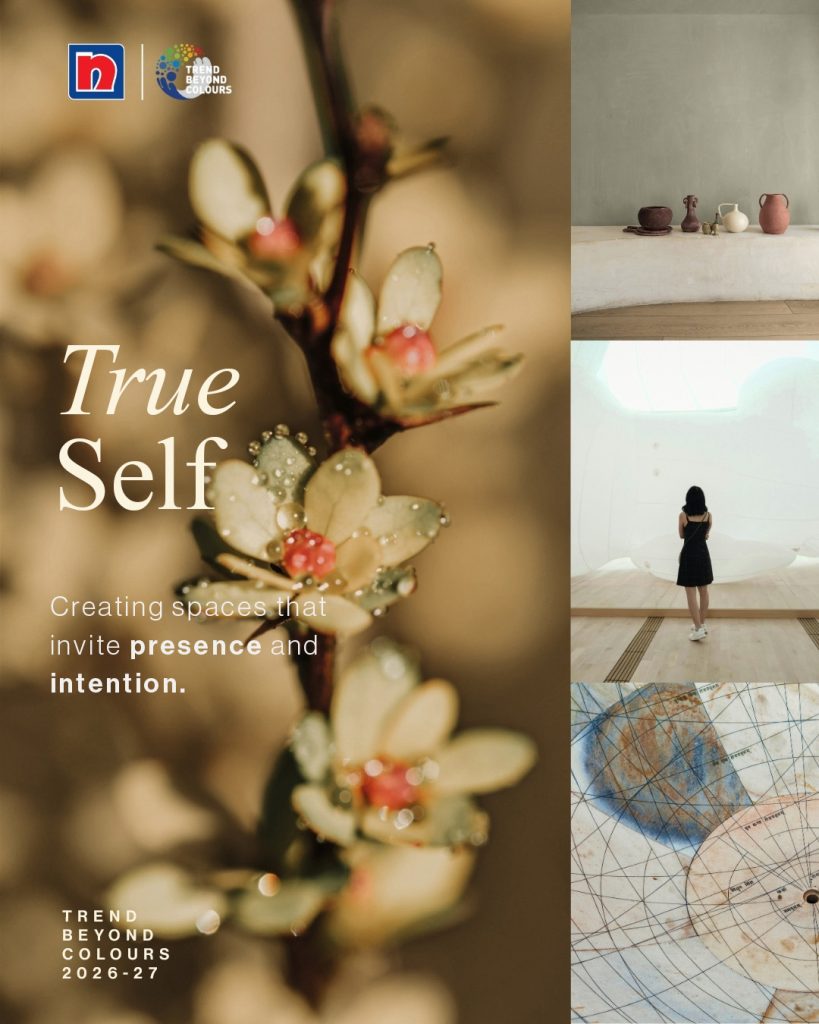
In the built environment, this trend signifies a return to tactile craftsmanship and materials that evoke a sense of authenticity. The True Self palette is an anchor, built on rich, organic tones that evoke authenticity and tradition. It is ideal for spaces designed to feel personal and stable. Rich, earthy shades like Woven Straw or Brick House, paired with the deep, dependable Postman Blue and natural finishes like walnut or wicker, create a sense of history and timeless comfort.
Now is Next: Crafting the Spaces of Tomorrow
A powerful sense of curiosity about the future is also shaping design. Driven by everything from the entrepreneurial energy of the AI boom to a general spirit of bold exploration, people are confidently looking past the present to define what comes next.

The Now is Next palette embodies this futuristic energy, offering a sleek, ambitious, and polished aesthetic. For designers, these colours are practical tools to convey progress and a forward-thinking identity. The palette is perfect for forward-thinking corporate, tech, or retail concepts, using the interplay of sleek metallics with the cool, otherworldly tones of Blue Planet and Monsoon Light to create an environment that feels focused, modern, and intentional.
Between Worlds: Creating Immersive, Hybrid Environments
We all navigate a hybrid reality, balancing our deeply digital lives with a deep desire for genuine, in-person connections. In response, a new focus on gatherings that prioritise shared experiences is emerging to counter digital isolation.
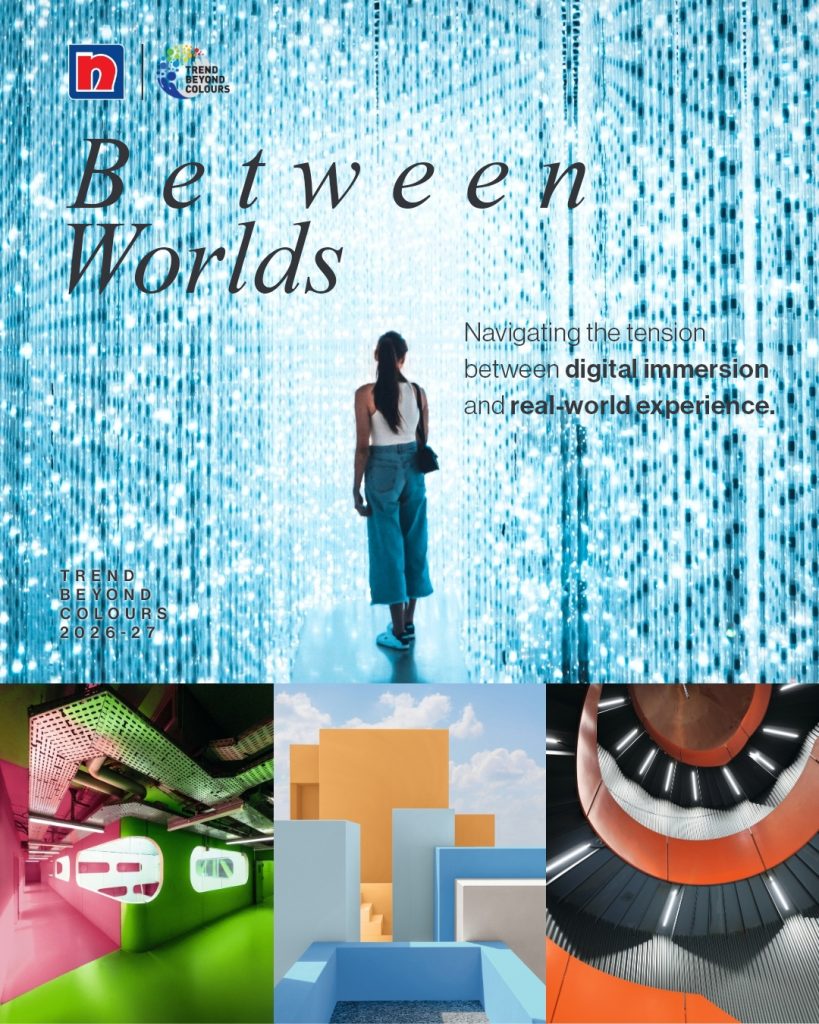
This duality sparks the Between Worlds palette. It is vibrant, youthful, and immersive, bridging the gap between the digital and physical realms with optimism. For designers, this is about creating “Fourth Spaces” that bring together the best of both worlds. Iridescent finishes, such as the clear Glitzy Blue or the juicy, attention-grabbing Party Time, balance screen-like hues to create dynamic and engaging spatial experiences.
A New Design Language
These four stories transcend trends to offer insightful perspectives on the evolving human experience. As Jo-Lynn Yap, Senior Manager for Group Colour Leadership, explains, ‘We believe that our Colour Stories have truly brought to light valuable insights that professionals can translate into useful foresights that will inspire and inform their creative process.
Ultimately, ‘Resonate’ is how we partner with the design community. It provides a shared language to help create spaces that are not only functional but also deeply connected to the people who inhabit them.